Rage Against Bad Network Diagrams

I recently got drawn into a bit of LinkedIn rage bait: a post with a CCNA level question asking people to identify the broadcast domains in a given diagram. The diagram was simple enough and it was pretty clear what the question was trying to test, an understanding of what a broadcast domain is. The question did, however, elicit a lot of discussion. It left enough ambiguity that there was a valid answer for multiple interpretations.
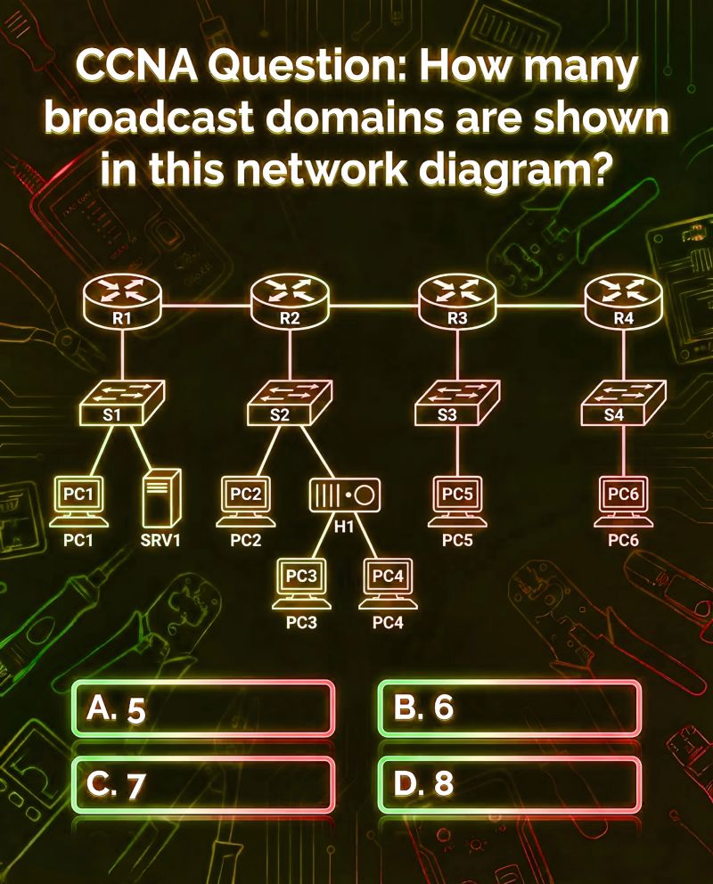
The diagram in question is this:
Let's start with the obvious fact that the question is clearly trying to test knowledge of what a broadcast domain is.
A broadcast domain is a segment of the network where all devices receive a copy of every broadcast frame sent.
The question clearly expects the answer to be 7 based on the three links between the routers and the further 4 networks segments with devices connected via switches. However, the diagram is ambiguous enough that any answer could be a valid interpretation. That doesn't mean all of the answers are correct because most tech exams are testing for a specific piece of knowledge and sometimes being a bit too clever can trip people up. However, the diagram is a great example of how bad diagrams can lead to confusion and misinterpretation.
Let's start with the four obvious network segments, the ones where each router is connected to a switch with one or more devices connected. Each of those segments is clearly at least one broadcast domain right? The hub H1 is probably a red herring to distract people with collision domains which are also a big thing at CCNA but not relevant to the question. So that's four broadcast domains accounted for. But what if those switches are vlan aware? What if R1 has two 802.1Q tagged sub-interfaces and the switch S1 has two vlans configured to separate the PC and Servers into different subnets? We could be looking at 5 or more broadcast domains now and perhaps more if the PCs connected to S2 and H1 are in different departments are separated into three separate vlans; we could be above the maximum 8 for option D pretty quickly. We've also not touched on the possibility of private vlans which could further increase the number of broadcast subdomains in this part of the diagram or the very real possibility that the switches are layer 3 switches and routing is being done on them which would also increase the number of broadcast domains.
Next up comes the three links between the routers. The diagram shows four routers connected to each other with simple lines. The question is, what type of links are these? There was some debate about if it mattered if the links were point-to-point serial links rather than ethernet links. In reality, it doesn't matter because both types of links would constitute separate broadcast domains. The ambiguity created quite a bit of debate on the post around /31 addressing and whether point-to-point links could be considered part of the same broadcast domain, the ability to do MAC broadcasts to FF:FF:FF:FF:FF:FF is what matters here. More interestingly for me was the overlooked possibility that each link could have multiple 802.1Q sub-interfaces configured on them. This is a common enough practice, especially where there are multiple vrfs running on those routers. In that case each link could represent multiple broadcast domains. So, the answer to the question could be very high if you consider that possibility.
We also haven't considered the possibility of tunnel interfaces between the routers which could also represent separate broadcast domains.
What about going the other way? I have a friend and colleague who is a big fan of the bridge domain concept. There are plenty of scenarios where you might want to bridge multiple interfaces together on a router. If we consider that possibility then the answer could be as low as 1 if all the links and switch segments were bridged together into a single broadcast domain.
The point of all this is not to nitpick a simple CCNA question but to highlight how bad diagrams can lead to confusion and misinterpretation. A simple diagram like this should be unambiguous and clearly convey the intended meaning. In reality, network diagrams are often poorly drawn, lack context, and leave too much to interpretation. This can lead to misunderstandings, misconfigurations, and ultimately network issues.
Diagrams need to capture the necessary detail to convey the intended meaning without overwhelming the viewer with unnecessary information. They also need to be appropriate to the target audience: the diagram above is appropriate for a CCNA level question but it was too ambiguous for the broad assembly of pedants of LinkedIn.
So, next time you're creating a network diagram, take a moment to consider the level of detail and context needed to convey your message clearly. A well-crafted diagram can be a powerful tool for communication, while a poorly drawn one can lead to confusion and frustration.