Vibe code project: Internet Map

I've always been more interested in the plumbing of the internet than the web pages sitting on top of it. Every time you load a page, your packets hop across a patchwork of independent networks called Autonomous Systems (ASes), each with its own ASN (Autonomous System Number). Who connects to whom, and how, is what I wanted to map. Now that it's so easy to vibe code with AI, any idea or interest can be turned into a project in minutes. So I built an interactive map of the internet's AS-level topology, and here's how it works and what it shows.
Randall Munroe got there first, obviously. XKCD 195 mapped the IPv4 address space as a Hilbert curve back in 2006, and XKCD 802 charted the relative populations of online communities like continents on a world map. Both are brilliant.
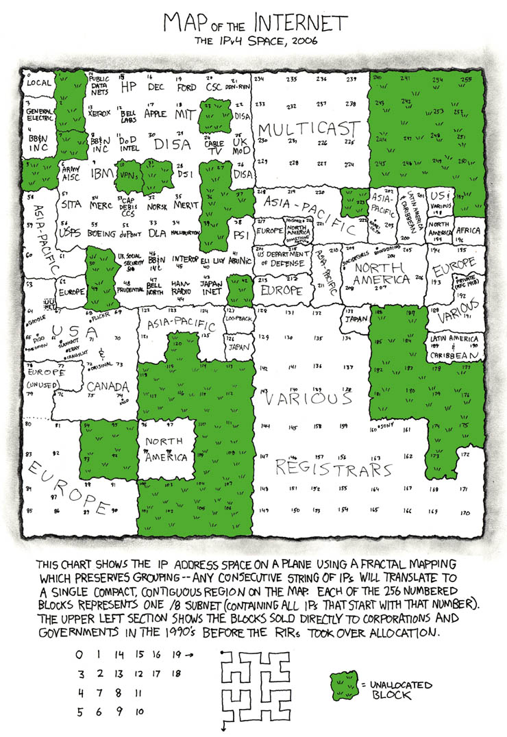 XKCD 195 by Randall Munroe, CC BY-NC 2.5
Mine is different, I promise, because it maps the routing relationships between networks rather than addresses or users. Also mine is interactive, which I'm going to count as a win.
This was a vibe coding project: I had a rough idea, let the AI write most of the code, and steered it toward something I found interesting. Here's what it does and what it found. I then left it to run overnight to collect the data I needed. In the morning I found that it had completed 83 seconds after I went off to bed.
Where the data comes from
The internet's routing fabric is surprisingly transparent. BGP (Border Gateway Protocol) is the protocol that knits all those independent networks together, and public route servers run by projects like RouteViews and RIPE NCC's RIS let anyone log in and grab a full copy of the global routing table.
A typical BGP route entry looks like this:
*> 1.0.0.0/24 203.0.113.1 0 13335 15169 i
That trailing sequence, 13335 15169, is the AS path: every autonomous system the route advertisement passed through to reach this vantage point. It's a breadcrumb trail across the internet.
I used Copilot to build a Python tool that connects to 76 public route servers over Telnet and SSH, streams their full BGP tables, and pulls out those AS paths. From a single run across 30 reachable servers I got 302,563 routes, covering 17,621 unique ASNs and 24,299 peering relationships.
Building the graph
Processing an AS path is straightforward. If 13335 sits immediately before 15169, that's a directed edge 13335 → 15169. The more routes that share an adjacency, and the more independent vantage points that confirm it, the stronger that edge.
The result is a NetworkX directed graph where nodes are ASNs (annotated with prefix counts and path frequency) and edges carry a weight and vantage_count. The graph exports to GraphML, GEXF, JSON, and CSV.
The visualisation
With 17,000+ nodes, SVG-based layouts fall over. I used D3.js with Canvas rendering instead, drawing every node and edge directly to a <canvas> element on each simulation tick, which stays smooth even at this scale.
The layout uses D3's force simulation to find a natural arrangement:
- Charge force pushes nodes apart
- Link force pulls connected nodes together, with distance scaled inversely to edge weight (heavily-used peerings pull ASes closer)
- Collision force stops nodes from overlapping
Nodes are coloured by degree (number of direct peers):
| Colour | Tier |
|---|---|
| 🔴 Red | Tier-1 hubs, degree >= 100 |
| 🟠 Orange | Major networks, degree 20-99 |
| 🔵 Blue | Mid-tier, degree 5-19 |
| ⚫ Grey | Leaf nodes, degree < 5 |
Node size scales with observed_count, which tracks how often an ASN appears anywhere across all BGP paths. It's a decent proxy for how central a network is to internet routing.
The whole thing is a single self-contained HTML file (~2.7 MB, data embedded) with no server needed. You can zoom, pan, click a node to highlight its neighbourhood, search by ASN, and filter low-weight edges to cut the noise.
What the graph reveals
The structure is scale-free: a small number of ASNs connect to enormous numbers of peers while the vast majority have just one or two upstream connections. Think of it like a city's road network: a few motorways carry most of the traffic, branching out into countless residential streets. The well-known Tier-1 carriers dominate the core: AS3356 (Lumen/Level3), AS1299 (Telia), AS6939 (Hurricane Electric).
That pattern makes sense. The internet grew by preferential attachment, where new networks tend to connect to already well-connected ones because that's where the traffic is. Scale-free structure is the natural result.
What surprised me was the regional clustering. European IXP participants bunch together, as do Asia-Pacific and Latin American networks, even though the layout algorithm has zero geographic information. Connectivity patterns alone reveal geography.
Exporting for print
The interactive view is great for exploring, but I liked the look of it and thought it would be a good addition to my office wall. A few minutes later I had an export tool. The tool exports a 3x high-resolution PNG of whatever's on screen, and a full vector SVG at A3 landscape with labels on the major hubs, ready to open in stuff like Inkscape.
You can explore the most recent version here.